
Therapist Website Examples: What the Good Ones Have in Common
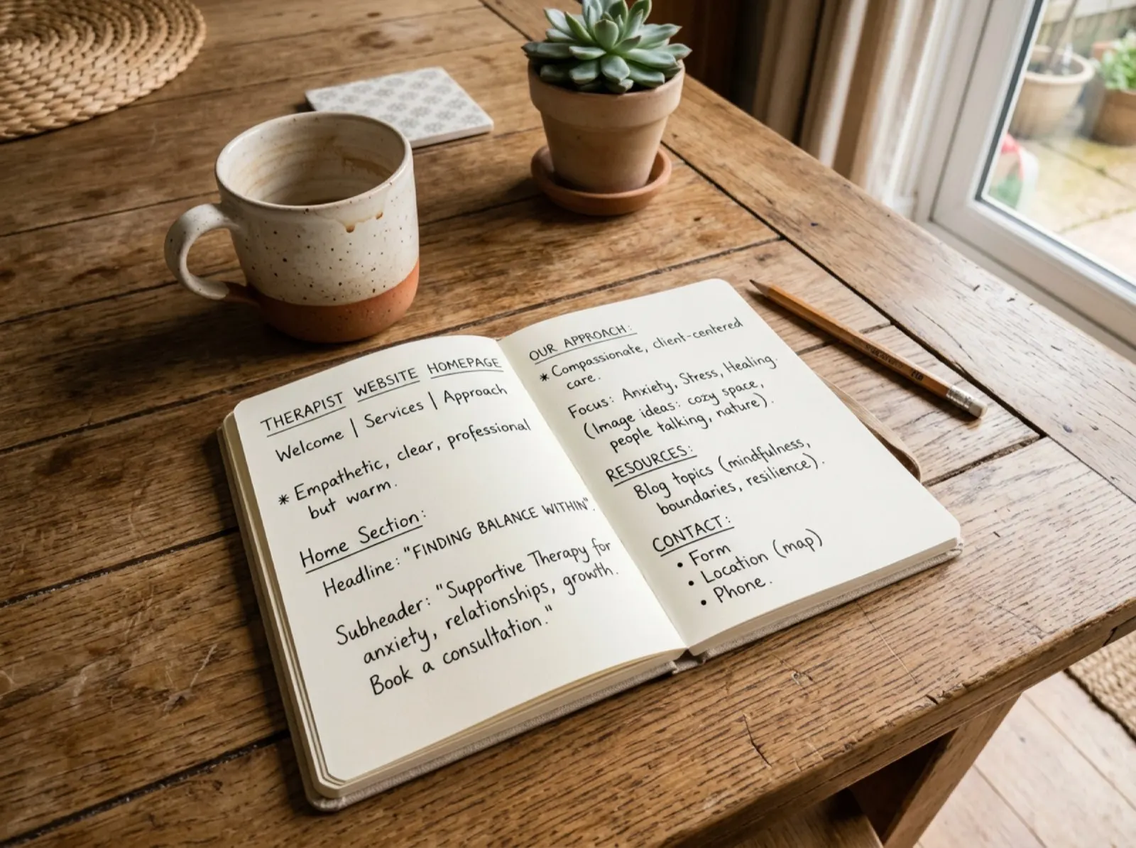
The best therapist website examples aren't the prettiest ones. They name who they help in the first line, show fees and how to start, sound like a real person, and put a "book a consult" button within reach on every page. Below are nine real solo and clinician-led sites worth studying, and the ten things the good ones have in common.
You're probably at your kitchen table after a full day of sessions, clicking through other therapists' sites with fourteen tabs open. One feels calm and clear. Another is beautiful, but you can't tell who it's for. Then the doubt creeps in: do I need photos like that, a clever tagline, a more polished voice? You don't. You need a site that helps the right person feel safe enough to take the next step.
I'm a licensed psychologist with a full private practice in Austin. When I opened, I sent more than 50 networking letters and my phone stayed quiet; it took about eight months to get traction on referrals. Over the last four months, all but two of my new inquiries found me on Google or ChatGPT. That's why I care so much about what a website says, and how plainly it says it.
Business education, not legal or marketing-compliance advice. Your licensing board's advertising rules come first.
The short version
- Clarity beats design. People form a first impression of a webpage in as little as 50 milliseconds, so your first screen should say who you help, not "Welcome."
- Specific beats broad. "Therapy for anxious high achievers" helps a visitor recognize themselves. "A variety of concerns" doesn't.
- Logistics build trust. Fees, insurance or superbills, location, telehealth states, and what happens after they reach out.
- One clear next step. The same "Book a free consult" button, repeated at natural points.
- Study, don't copy. Notice structure and tone, then write in your own voice.
In this guide
- Therapist website examples worth studying
- The 10 things great solo practice websites have in common
- What the research says about first impressions and trust
- How to use these examples without copying them
- Frequently asked questions
Therapist website examples worth studying
These are public websites of solo or clinician-led practices, each checked as live in November 2026. This isn't a ranking, and no site is perfect. Each one shows a pattern worth borrowing. Open them on your phone, since that's how most clients will see yours.
| Website | Practice | What to notice |
|---|---|---|
| Ever Be Therapy | Dr. Ann Krajewski, PsyD, virtual in Virginia and DC | A headline in the client's words ("You've Achieved Everything… Except Peace of Mind"), a clear niche of high-achieving professionals, and separate city pages for Arlington and Washington |
| Cristeta Rillera, LMFT | Solo LMFT in Woodland, California | The headline names the specialties ("Anxiety, Trauma, and Relationship Therapy"), and a "Schedule free consultation" button sits right below it |
| BLW Therapy | Brent LoCaste-Wilken, LCSW, Houston | A plain, searchable headline ("Therapist in Houston, TX"), cash rates listed on the page, and telehealth states spelled out |
| Jennifer Mancuso Urban, LCSW-R, PMH-C | Solo practice in Orchard Park, New York | A short, specific headline ("Individual therapy for women"), perinatal focus backed by a certification, and the session fee shown up front |
| Jessica Meiman Psychotherapy | Solo LMHC, online in New York and Connecticut | Warm, reader-first copy and a "Book a free consultation" button repeated through the page |
| Jonathan Shehee | Licensed psychoanalyst, New York City | A one-sentence headline that says exactly who he helps: people dissatisfied with their lives, "particularly in their relationships or their search for a partner" |
| Dr. Keely Kolmes | Licensed psychologist, video therapy | A "How can I help you?" first screen that routes therapy clients, consulting, and speaking separately, plus licensure states listed plainly |
| Alicia H. Clark, PsyD | Psychologist-led practice in Washington, DC | A strong niche point of view on anxiety, with an anxiety questionnaire as the first-screen call to action |
| Dr. Sara Douglas | Licensed psychologist, New York City | A psychologist website example for an assessment practice: the headline is simply the service, "Neuropsychological evaluations" |
As you look, ask three questions a tired, worried visitor is asking: Am I in the right place? Can this person help with what I'm carrying? What do I do next?
The 10 things great solo practice websites have in common
1. The first screen says who they help
The first screen, before anyone scrolls, names the person and the pain or goal. Instead of "Welcome to my practice," try "Therapy for anxious adults who look fine on the outside but feel exhausted inside."
2. They speak to a specific person, not everyone
A defined audience doesn't mean you only see one kind of client. It means a visitor recognizes themselves. A couples therapist might write, "You keep having the same fight and both of you leave feeling misunderstood," rather than "I help couples improve communication."
3. They use warm, plain language
Clients don't know diagnostic terms; they know they're not sleeping, they're snapping at their partner, or they're replaying conversations at 2 a.m. Instead of "I treat dysregulated affective states," write "I help people who feel flooded, shut down, or unable to calm their body once stress takes over."
4. They make the next step obvious
Use one call to action, worded the same everywhere: "Book a free consult" near the top, after your specialties, and at the bottom. When someone is finally ready, a hunt for the contact page can be enough to make them put it off.
5. They explain who is a good fit
A kind, direct fit statement helps the right people feel confident and helps others keep looking. For example: "My practice is a good fit for adults ready to look at old patterns with compassion. I'm not the best fit for court-ordered evaluations or crisis support." Name your crisis resources, such as 988, for anyone who needs help now.
6. Their About page still centers the client
The About page is where people decide, "Can I trust you with this?" Blend training with warmth, and tie your experience back to the reader. Open with something like, "Clients often come to me after years of being the dependable one," before the list of degrees.
7. They show what happens after you reach out
Many visitors have never been to therapy. Spell out the path: "Send a message. I'll reply within two business days. If it seems like a fit, we'll schedule a 15-minute call, then decide together about a first session." Your intake paperwork, including informed consent, can be described here in a sentence.
8. Fees and logistics are easy to find
People are doing emotional math: Can I afford this? Can I get there? Do you see people in my state? Show your fee, insurance or superbills, session length, location, and telehealth states, and include a sliding-scale note if you offer one. If you haven't set your number yet, the free therapy fee calculator works it out from your real costs.
9. The menu is simple
Most strong solo sites have a handful of clear pages: Home, About, Services (or one page per specialty), Fees, FAQ, and Contact. Clever labels make people guess. "Services" is clearer than "Work With Me," and "Contact" is clearer than "Begin."
10. They sound like the therapist, not a template
The best sites have a recognizable voice. Instead of "I provide a compassionate and nonjudgmental environment," a therapist might write, "I won't rush you to make meaning out of things that still hurt." A real, recent photo helps too; our therapist headshots guide covers what works.
How Well Launched helps: this is the part that turns into a month of late nights. Launch writes your pages from your answers about who you help, so you review and approve instead of facing a blank page, then designs, builds, and hosts the site, with each specialty page mapped to a real local search. You're not just set up. You're up. See therapist website design with Launch.
What the research says about first impressions and trust
Most of these patterns line up with research on how people judge websites and on what helps therapy start well. The studies don't test therapist websites directly, so treat them as support for common sense, not proof.
| Finding | Study | What it means for your site |
|---|---|---|
| People form a visual impression of a webpage in about 50 milliseconds | Lindgaard, Fernandes, Dudek, and Brown (2006) | Make the first screen calm and clear |
| In a study of 2,500+ participants, "design look" was the most-mentioned credibility cue (about 46% of comments), ahead of information structure and focus | Fogg and colleagues (2003) | Clean layout and organized information read as trustworthy |
| The working alliance includes agreement on goals and tasks | Bordin (1979) | Naming the client's problems and hopes starts that agreement early |
| The alliance is related to outcomes across many kinds of therapy | Horvath, Del Re, Flückiger, and Symonds (2011) | A warm, specific voice helps someone sense fit before the first call |
| About one in five adult clients ends therapy early (19.7% in a meta-analysis of 669 studies) | Swift and Greenberg (2012) | Clear expectations about fees and process support an informed start |
How to use these examples without copying them
The goal isn't to make your site look like someone else's. It's to notice what works and translate it into your own voice. Open three of the examples above and ask:
- What does this site make clear in the first five seconds?
- Who does this therapist seem best suited to help?
- Which words feel emotionally specific?
- Where do I feel trust go up, and where do I feel confused?
- How many taps does it take to book?
- What would I change for my own clients, values, and state?
Then check your draft against your board's advertising rules: your license title, any required disclosures, and what you can and can't claim. Our guide to ethical mental health marketing covers the common rules, and private practice rules by state links each board's official page.
A few things to leave out, whatever the examples do: client testimonials (most ethics codes bar soliciting them), promised outcomes, and copied text, which won't rank and won't sound like you. For page-by-page detail, read website design for therapists; to choose a platform, see the best website builders for therapists. A clear site also helps you get found: pair it with a complete Google Business Profile.
If you're still at the start, the free practice checklist puts your website in order with everything else, so you're not building it before you know your fee or your niche.
Frequently asked questions
What should a solo therapist put on their homepage?
Who you help, what concerns you work with, where you see clients (in person or which telehealth states), how you work, your fee or a link to it, and one clear button to book a consult.
Think of the homepage as a guide, not an autobiography. Its job is to help someone decide where to click next.
What do the best therapist websites have in common?
They name the client's experience in the first line, make booking easy from every page, show fees and how to start, use a real photo of the therapist, and load quickly on a phone. The same rules apply to psychologist website examples.
Do I need a niche for my therapist website?
You don't need an extremely narrow niche, but you do need clear language about who you help. "Adults with anxiety, burnout, and relationship stress" is already more useful than "individual therapy for a variety of concerns."
Should I list my therapy fees on my website?
In most cases, yes. Listing fees builds trust, saves time for both of you, and helps people decide before reaching out. If you offer superbills or sliding-scale spots, say so plainly.
How many pages does a therapist website need?
Most solo sites can start with five: Home, About, Services, Fees, and Contact. Add an FAQ page and one page per core specialty as your practice grows; specialty pages also help you show up in search.
Can a simple therapist website still get clients?
Yes. A simple site works well if it's clear, warm, and easy to use. Fewer pages with stronger writing usually beat a large site with vague copy.
Should I copy wording from therapist websites I like?
No. Use other sites to learn structure, clarity, and the questions they answer, then write in your own voice. Copying can create ethical, legal, and trust problems, and it won't rank.
Sources
- Lindgaard, G., Fernandes, G., Dudek, C., & Brown, J. (2006). Attention web designers: You have 50 milliseconds to make a good first impression. Behaviour & Information Technology, 25(2), 115–126.
- Fogg, B. J., Soohoo, C., Danielson, D. R., Marable, L., Stanford, J., & Tauber, E. R. (2003). How do users evaluate the credibility of Web sites? A study with over 2,500 participants. Proceedings of the 2003 Conference on Designing for User Experiences.
- Bordin, E. S. (1979). The generalizability of the psychoanalytic concept of the working alliance. Psychotherapy: Theory, Research & Practice, 16(3), 252–260.
- Horvath, A. O., Del Re, A. C., Flückiger, C., & Symonds, D. (2011). Alliance in individual psychotherapy. Psychotherapy, 48(1), 9–16.
- Swift, J. K., & Greenberg, R. P. (2012). Premature discontinuation in adult psychotherapy: A meta-analysis. Journal of Consulting and Clinical Psychology, 80(4), 547–559.
- Example websites: each linked in the table above, reviewed November 1, 2026. Details can change after that date.
- Search volume for "therapist website examples" (about 390 a month in the U.S.): Semrush keyword export, October 2026
Build a site that sounds like you
The free checklist puts your website in the right order with your fee, paperwork, and Google profile. Launch writes, designs, builds, and hosts your site with you, for one payment instead of a monthly retainer.
Related: How to start a private practice as a therapist · Website design for therapists · Best website builders for therapists · Therapist headshots
Free tools: therapy fee calculator · startup cost calculator · rules by state · Psychology Today counter